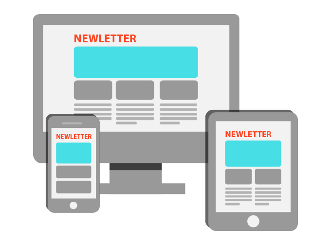
Are your emails mobile friendly? As mobile internet usage continue to grow, it has become critical for email marketers to reach their customers effectively, by adopting a responsive design.
Responsive design is an approach to web design that aims at providing an optimal viewing experience across all devices.
Without any doubts, the future of email is responsive.
Current mobile emails stats show that more than 70% of emails are opened on mobile phones (2017 data) and that 80% of people delete an email if it doesn’t render properly on their mobile device.
This means that businesses have to take into consideration this trend and develop emails with the latest responsive methods. Failure to adapt to responsive design will result in customers missing out on important communication, lower levels of engagement and eventually lower email marketing ROI.
Tips on How to Achieve Responsive Design
The best and the easiest way to handle mobile email optimization is by focusing on making email design that is friendly to mobile devices. This can be achieved through the following tips:
-
Keep the Layout Simple
Using a simple stacked layout with a maximum width of 600 pixels optimal will improve the message visibility as opposed to multi-column layout (which displays better on most tablets).
-
Use Readable Fonts
In general, always prefer bigger fonts which should be basic and web-safe, like Arial, Helvetica, Georgia and Tahoma. Font size should be at least set to 14 pixels for body copy and 22 pixels for headlines. Remember to use only highly contrasting colors for maximum viewability and to avoid background images since many email clients, such as Outlook, don’t support them. Use a solid background color as a fallback instead.
-
Add Optmized Images
Be sure your images are sized correctly, no longer than 100kb for each one. Consider also using animated GIFs. They are a great way to make your emails more creative and attract attention to your product or service. Make sure that your newsletter looks great also without images (many email clients could block them automatically) adding background alt attributes to all of them (ALT tags).
-
Choose Intuitive Call to Actions
Be direct. Tell your recipients what they should do using bulletproof CTA buttons. Set 44*44 pixels size to your CTA buttons and make them fully clickable. Adding “Click here” to your message does not work because it’s not a real call to action. It’s much better to try something more personal and intuitive, ex. “Get your copy for free” or “New collection available now”, etc. This will allow user or customers to be able to easily know what you want and respond immediately.
The Importance of Responsive Email Design
Better UX
By using responsive design, your business customers will have a better user experience. People will be able to read your newsletter whether they are on a desktop or a mobile device like smartphone or tablet. As a result, they would probably have a positive opinion about you. Poor user experience risks losing clients because they are likely to delete the email, hence they will not receive the intended communication.
Increased Conversion Rates
Responsive design has a significant impact on email conversions. Recent studies found that email marketers who used responsive emails achieved a 15% increase in unique clicks for mobile and a CTO (click-to-open) rate of 14,1%, 40% higher compared to CTO rate of non-responsive emails.
Compliance with Anti Spamming Regulations
Most customers will classify non-responsive newsletter as spam messages; your emails end up being deleted. By using responsive email design, your emails will look impeccable, and your clients will be able to identify them as important communication easily.
To take advantage of all these benefits, businesses can make use of responsive email design by using a newsletter software like MailStyler. You can download the MailStyler demo for free and test all features.
MailStyler – perfectly compatible with SendBlaster 4 – is a powerful drag and drop editor that allows users to create pixel-perfect responsive email templates easily. No technical skills are required: thanks to its incredible flexibility users can enjoy unlimited design possibilities.
A great solution to send beautiful mobile-ready emails that adapt perfectly to all different devices and screen sizes.
There is no time left, go responsive!